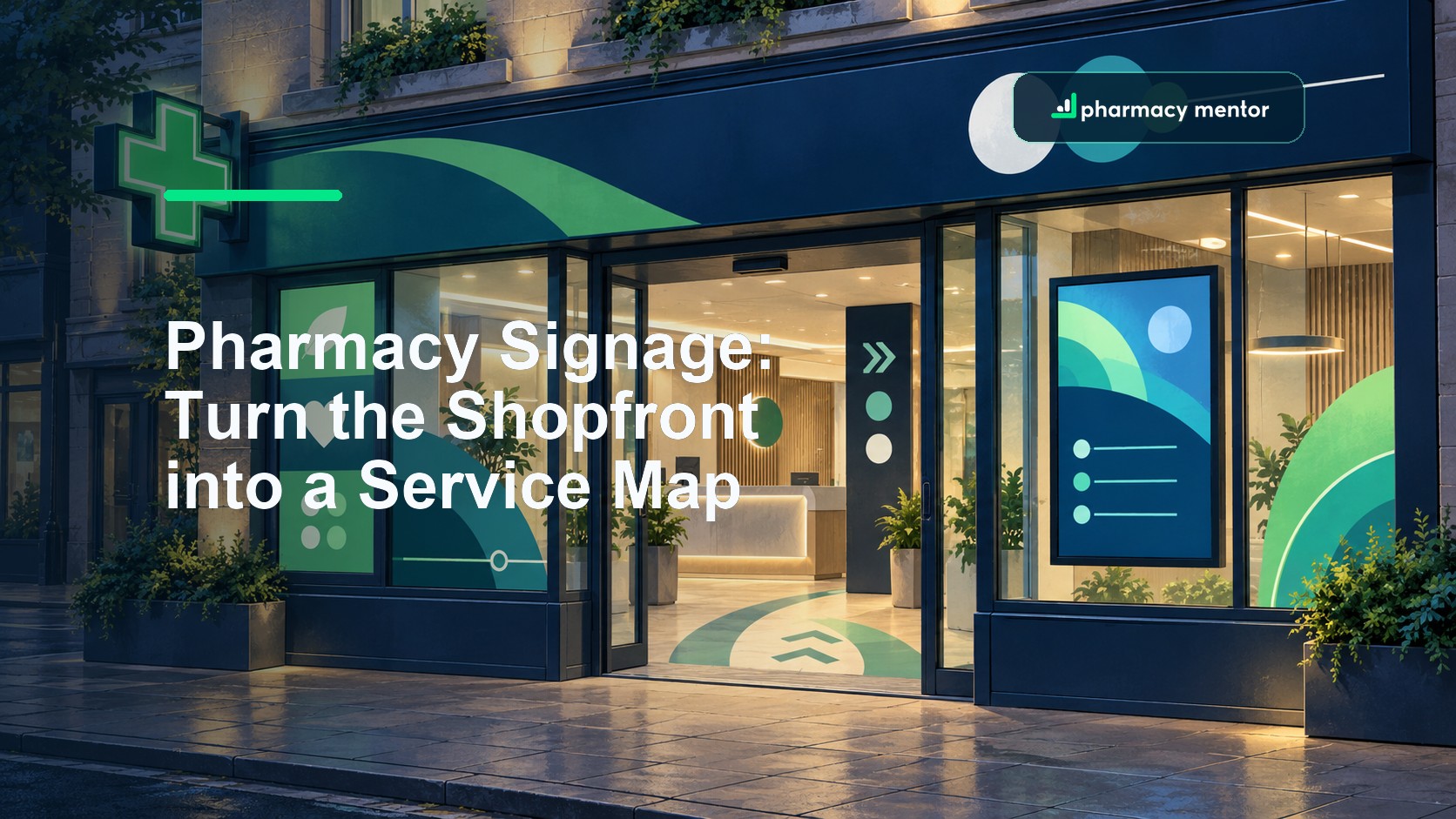
A pharmacy window can advertise twelve services and still tell a passer-by almost nothing. When every panel competes for attention, the person outside has to work out whether the pharmacy offers the service they need, whether it is open and what they should do next.
Pharmacy signage works when it behaves like a service map. The fascia identifies the business, the window helps people recognise relevant services, wayfinding carries them through the premises, and safety or statutory signs protect specific decisions. Every sign needs an owner, an approved message and a place in that journey.
What should pharmacy signage achieve?
It should make the pharmacy easy to identify, help people understand the services genuinely available, show an accessible next step, support privacy and safe movement, and remain accurate as services change. A useful signage plan combines brand, service communication, wayfinding, accessibility, advertising controls, maintenance and measurement instead of buying unrelated boards one at a time.
Inventory the complete sign system
Begin with photographs and a walk-through, not a catalogue. Approach from each common direction, visit in daylight and after dark, and follow the routes used by pedestrians, drivers, wheelchair users, delivery teams and people collecting from an out-of-hours point. Record every permanent sign, window poster, screen, pavement board, counter notice, directional marker and safety sign.
For each item, capture its purpose, audience, message, location, size, condition, owner, approval date and review trigger. Include signs supplied by NHS bodies, service commissioners, buying groups, manufacturers and landlords. A professionally printed panel can still be wrong if a service has ended or its eligibility has changed.
| Sign layer | Decision it should support | Evidence to review |
|---|---|---|
| Identity | Is this the right pharmacy and is it open? | Trading name, logo use, opening information, visibility and illumination |
| Service | Is the relevant service available and what is the next step? | Current service list, eligibility boundary, booking route and staff capacity |
| Wayfinding | Where should the person go without disclosing their need? | Entrances, consultation rooms, counters, collection points and accessible routes |
| Safety | What action prevents a significant residual risk? | Risk assessment, mandatory form and location, visibility and obstruction |
| Campaign | Is this message current, approved and appropriate for the public? | Offer dates, claims, medicine status, terms, source and withdrawal date |
Use the audit to remove duplication before adding anything. If four posters all say the pharmacy offers vaccinations, one clear service panel with a booking route may perform better. If the window promotes an appointment but the door says “walk in”, resolve the operating decision before redesigning the artwork.
Build the journey from the service map
Map the pharmacy's current services, how people access them and which ones need advance preparation, privacy or an eligibility check. This turns signage from decoration into a series of deliberate hand-offs.
- Recognition: a person should be able to identify the pharmacy from a useful distance without confusing it with a neighbouring business.
- Relevance: the window or external service panel should help the intended audience recognise a need, not present an internal list of everything the pharmacy can do.
- Action: give one realistic next step such as entering, asking at the counter, scanning an accessible QR code or using a maintained booking URL.
- Arrival: guide the person to the correct queue, room or collection point without requiring them to announce sensitive information publicly.
- Completion: make follow-up, collection or exit routes clear where the service design needs them.
The public wording should match the website, booking system and staff explanation. Our guide to launching private pharmacy services covers the wider readiness work behind a service promise. A sign must not get ahead of trained staff, commissioned scope, available stock or a working booking route.
Use the pharmacy's brand system to set colour, type, illustration, icon and spacing rules. Our pharmacy branding service approaches those assets as one recognisable system rather than a succession of disconnected campaigns. Contrast and legibility come before an elaborate layout; the message must work at the viewing distance and in the light where it will actually be seen.
Check permissions and advertising controls
External signs can need permission. The government's guide to outdoor advertisements and signs explains England's advertisement-control system and the circumstances in which consent may be needed. Local rules, listed buildings, conservation areas, landlord terms and highway considerations can affect a project, so confirm the position for the actual premises before manufacture or installation.
Content approval is a separate decision. The CAP Code section on medicines, medical devices, health-related products and beauty products includes restrictions on public advertising of prescription-only medicines and prescription-only medical treatments. The MHRA's current Blue Guide gives detailed guidance on advertising and promoting medicines in the UK.
Do not assume a short shop-window line is too small to count as advertising. Review the whole communication: headline, image, price, qualification, QR destination and what a reasonable member of the public is likely to understand. Keep the approved wording, evidence, approver and expiry date together.
Safety signs have a narrower purpose. HSE guidance says signs should be used where a significant risk remains after other controls and should be clear and legible; it also warns against using too many. Connect each safety sign to the pharmacy risk assessment rather than treating a wall of notices as a substitute for control.
Design accessible wayfinding and privacy
Test the route with people who did not design it. A sign may look obvious to the team because they already know where the consultation room is. Check whether a first-time visitor can find the entrance, accessible route, waiting area, counter, private room, collection point and exit without unnecessary questions.
- Use plain labels: choose words that describe the destination or action, not internal department names.
- Keep placement consistent: put directional information where a choice is made and confirm the destination on arrival.
- Protect dignity: avoid making a person stand beneath a highly specific condition label or declare their reason across the counter.
- Provide an alternative to QR codes: the same route should remain available to people without a suitable phone, data connection or confidence scanning a code.
- Test real conditions: include glare, darkness, window reflections, parked vehicles, temporary displays and queues.
The GPhC's standards for registered pharmacies make owners accountable for safe, effective services and expect people to be able to access pharmacy services safely. They also require privacy and confidentiality to be respected. Signage contributes to those outcomes, but it cannot compensate for an inaccessible route or a consultation area that does not protect conversation.
Brief and compare pharmacy sign suppliers
A supplier should receive a written site and content brief. Include measured locations, photographs, viewing distances, material constraints, landlord or planning status, electrical requirements, artwork ownership, accessibility expectations, installation access and the pharmacy's sign inventory. Mark which messages are final and which are awaiting regulatory or service approval.
Ask each shortlisted supplier to price the same scope and state exclusions. Compare survey quality, design development, materials, illumination, colour matching, fixings, access equipment, installation, electrical certification where relevant, warranties, repair response, artwork handover and safe removal. Confirm who carries out the final site check and who accepts the risk if supplied dimensions are wrong.
Request a scaled proof and a simple visual placed onto a photograph of the premises. Then print key text at representative size and view it at the intended distance. A desktop mock-up cannot reveal every obstruction or lighting problem. For a substantial refit, align the sign package with the workflow and customer-journey decisions in our pharmacy design service.
Control digital pharmacy signage
A screen can sequence messages and change them quickly, but speed increases the need for control. Decide which roles can publish, the approved templates and sources, how long each item stays live, what happens when the content player loses its connection and how the screen is secured.
Avoid rapid movement, unreadably short dwell times and a carousel that tries to communicate a complete service journey in fragments. Essential opening, safety or accessibility information should not depend on a screen being powered, connected or on the right slide at the right moment.
Treat the media player, account and network connection as part of the pharmacy's technology estate. Limit administrator access, change default credentials, apply supported updates and document the supplier's access. The controls in our pharmacy cybersecurity guide apply to a sign that is effectively a networked computer.
Measure, maintain and retire signs
Agree what success means before installation. Useful measures could include service enquiries that reach the correct team, booking-page visits from a specific QR route, fewer repeated directions inside the premises, reduced use of temporary paper notices and accurate removal of expired campaigns. Do not infer clinical or commercial success from scans alone.
Give every time-sensitive sign a withdrawal date. Add the sign audit to service-change, seasonal campaign, refurbishment and incident processes. Record damage, fading, failed illumination, peeling vinyl, blocked sightlines and inaccessible QR destinations. When a service changes, inspect the fascia, window, screen playlists, internal wayfinding and website together.
Review the small set of measures using the principles in our pharmacy data analytics guide. The aim is not to cover every surface. It is to keep the shortest useful set of messages accurate, visible and connected to a service the pharmacy can deliver.
Pharmacy Mentor helps pharmacy owners connect brand, customer journey, website and service growth. Explore our pharmacy branding support or talk to the team about a pharmacy signage and communications brief.

Saam Ali
Founder & CEO, Pharmacy Mentor · MRPharmSSaam Ali is a pharmacist, digital strategist and the founder of Pharmacy Mentor. He has worked across community pharmacy, healthcare marketing and digital product development since 2012, helping independent pharmacies build modern online services and reach more patients.